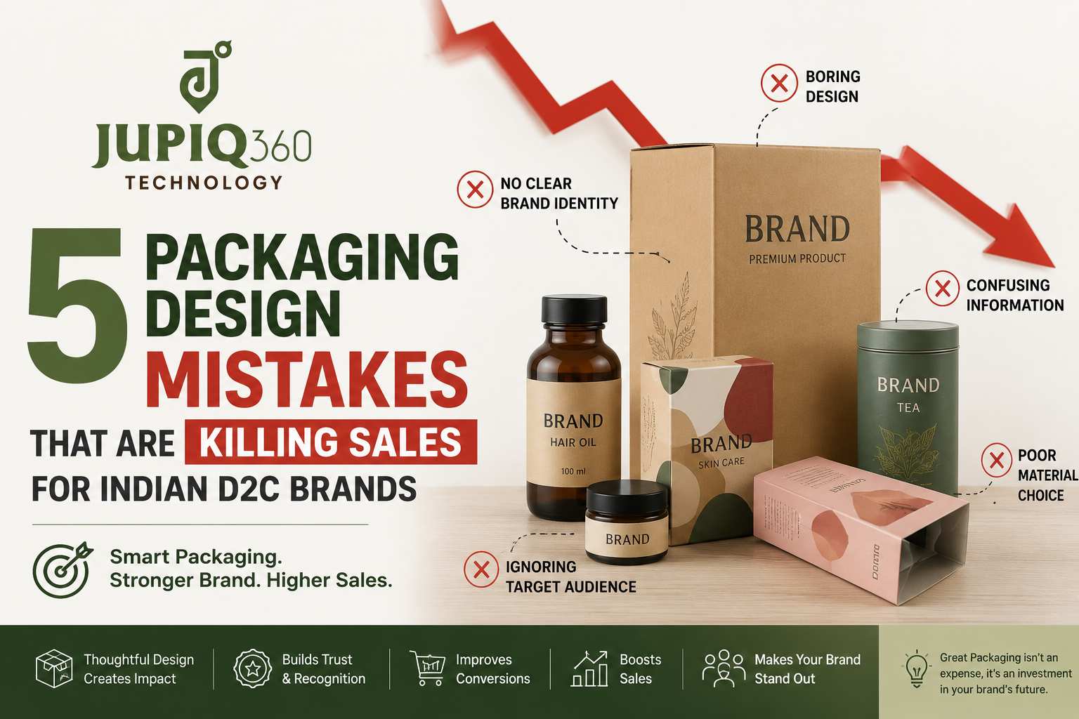
5 Packaging Design Mistakes That Are Killing Sales for Indian D2C Brands
Your product could be exactly what the market needs. The formula could be right. The price could be competitive. But if the packaging gets it wrong, customers won’t give it a second look.
Packaging is the first physical moment a customer has with your brand. It happens in three seconds on a retail shelf, in a thumbnail on an Amazon or Meesho listing, or in that moment when a courier bag lands at their door. For D2C brands, where there’s no shelf, no sales associate, and no store ambience, packaging carries even more weight — it is the entire physical brand experience.
And yet, the majority of Indian D2C founders treat it as an afterthought.
Research shows that 72% of consumers say packaging design influences their purchase decisions. If you’re spending on ads, influencer partnerships, and product development but losing customers at the packaging stage, you’re leaving money on the table every single day.
At Jupiq360, we’ve worked with product brands across Pune and Nagpur, and we see the same mistakes repeatedly — across food, wellness, beauty, and lifestyle categories. Here are the five most damaging ones, and exactly how to fix them.
Mistake 1: Overcrowded Labels That Confuse Instead of Convert
The instinct is understandable. You want to communicate everything — the ingredients, the benefits, the certifications, the tagline, the offer, the social handles. So it all ends up on the front panel.
The result? A label that exhausts the eye before the brain registers the brand name.
Overcrowding text is the most common D2C packaging mistake in India. When too many messages compete for attention on the front of the pack, you force the shopper’s brain to work too hard — causing them to skip your product entirely.
The discipline required here is ruthless prioritisation. Your front panel has one job: communicate your brand name, your product, and your single strongest claim — clearly, within three seconds. Everything else belongs on the side panel or the back.
If a shopper cannot identify your brand and primary differentiator within the time it takes to glance at the shelf, your package has already failed to earn a place in their consideration set.
The fix: Apply the three-second test to your current packaging. Hand it to someone who’s never seen it and ask: What brand is this? What does it do? And why should I buy it? If they can’t answer all three in three seconds, simplify. Reserve benefits, ingredients, and claims for the back panel where engaged customers will read them.
Mistake 2: Designing for Screen — Not for Shelf or Courier
Indian D2C brands often design their packaging in Canva or brief a designer based on how it looks on a laptop screen. It looks sharp in the mockup. It looks sharp on the brand deck. And then it arrives on a physical shelf, under fluorescent retail lighting, surrounded by competitors — and disappears.
Designing under ideal daylight-balanced conditions while ignoring the warm, directional, or harsh fluorescent lighting common in grocery and retail stores causes carefully chosen colours to shift, muddy, or lose contrast where it matters most.
There’s a second dimension to this for e-commerce brands. Packaging in 2026 has to function effectively across three channels without compromise: retail shelves for clear visibility and recall, e-commerce platforms for impactful thumbnails and strong digital readability, and experiential marketing that ties in with campaigns and influencer content.
A design that looks beautiful as a full-size photo often becomes illegible as a 200×200 pixel product thumbnail on Flipkart or Amazon. Your brand name shrinks. Your colour contrast fails. The customer scrolls past.
And then there’s the courier reality. India’s delivery ecosystem involves multiple handling points, variable temperatures, and rough transit. A beautifully designed box that arrives crushed tells your customer one thing: this brand doesn’t care about the details.
The fix: Always test your design in three environments before printing. View it under retail fluorescent lighting (or photograph it under a tube light). Resize it to a 200×200 thumbnail and check readability. And test your box structure physically — drop it, stack it, apply pressure — before committing to a print run.
Mistake 3: Ignoring FSSAI and Legal Metrology Compliance
This is the mistake that doesn’t just cost you sales — it can cost you your product’s entire shelf life, literally.
Many D2C founders, especially first-time food and wellness brand founders, treat compliance as a last-minute checklist item. They finalise a beautiful design, send it to print — and only then discover that the FSSAI logo placement is wrong, the veg/non-veg symbol is missing, or the font size on mandatory declarations is too small.
The result: a reprint. Delayed launch. Wasted inventory. And in some cases, products are pulled from platforms.
FSSAI imposes twelve primary labelling regulations for any food packaging, including the product name, ingredient list in descending order of weight, nutritional information, allergen declarations, the veg/non-veg symbol, the FSSAI logo and 14-digit licence number, batch number, manufacturing and expiry dates, manufacturer details, and storage instructions.
Beyond FSSAI, the Legal Metrology (Packaged Commodities) Rules apply to every packaged product sold at retail in India — food, cosmetics, hardware, wellness. For e-commerce listings, the mandatory declarations must also be shown digitally on the product page , not just on the physical pack.
Non-compliance can result in product seizure, fines up to ₹3 lakh, and removal from retail shelves and e-commerce platforms.
The fix: Integrate compliance into the design process from the very beginning — not as a final check, but as a design constraint. Know your required declarations before you brief your designer. Reserve space for the FSSAI logo, licence number, veg/non-veg symbol, and nutritional table in your initial layout. A packaging designer who understands compliance (not just aesthetics) will save you significant time and money.
Mistake 4: Generic Packaging That Looks Like Everyone Else
Walk down the health food aisle in any Pune supermarket. Count how many brands use the same combination: kraft paper texture, earthy green or orange palette, a leaf or grain illustration, and a sans-serif font with a wellness tagline.
Every one of those brands made the same decision independently, believing they were communicating “natural” and “trustworthy.” Collectively, they’ve created a wall of visual sameness where no individual brand stands out.
Following category norms so closely that the brand is invisible positions you as a generic alternative rather than a distinct choice — guaranteeing you blend into the visual noise.
This isn’t an argument for being loud or chaotic. It’s an argument for being intentional. The brands that win — mCaffeine, The Whole Truth, Mamaearth in its early days — made deliberate visual choices that differentiated them from their category’s visual language while still feeling appropriate for the space.
For Indian D2C brands, there’s an additional, underused advantage: India’s extraordinary design heritage. Cultural authenticity, regional art forms, vernacular typography, and Indian craft traditions are global differentiators — not just local ones. A Pune-based food brand that draws authentically from Maharashtrian visual culture isn’t just different — it’s telling a story no import brand can replicate.
The fix: Before briefing your designer, do a shelf audit. Photograph your top five competitors’ packaging in an actual retail environment. Identify the colour palettes, structural formats, and visual language that dominate your category. Then make deliberate choices to stand apart — not just aesthetically, but strategically. What does your brand stand for that theirs doesn’t? That answer should drive your design, not the other way around.
Mistake 5: Treating the Unboxing Experience as Optional
For D2C brands selling online, the moment a customer opens their package is the most powerful brand moment you have. It’s the first time they touch and experience your brand in the physical world.
Research shows that 52% of online consumers are more likely to reorder from brands that deliver in premium packaging. And about 42% of consumers will share a product on social media if it arrives in unique or premium packaging.
That second statistic is free marketing. An unboxing Reel on Instagram, a photo on WhatsApp, a story shared with friends — these are customer-generated endorsements that money can’t easily buy. They come from the moment your packaging lands at the door.
Most Indian D2C brands still ship in plain corrugated boxes with a generic thank-you insert printed in black ink. That experience signals one thing: this brand didn’t think about me beyond the transaction.
The unboxing experience doesn’t require a luxury budget. D2C brands have turned unboxing into a low-cost marketing channel with simple, high-impact choices: a well-designed inner mailer, a branded tissue paper wrap, a personalised thank-you card, a QR code that links to a product tutorial or a loyalty offer. Each of these costs a fraction of what you spend on a single ad campaign — and keeps working every time a customer shares it.
The fix: Design the unboxing experience as part of your packaging brief, not as an afterthought. Think about the sequence: what does the customer see when they open the outer box? What’s underneath? What do they hold last? Each step is a chance to reinforce your brand, delight the customer, and earn a share or a repeat purchase.
The Common Thread: Packaging as an Afterthought
All five of these mistakes share the same root: treating packaging design as a cost to minimise rather than an investment in customer acquisition and retention.
The most common underlying mistake is designing packaging without thinking about the outcomes — storage, shipping, shelf visibility, and conversion. Brands that treat packaging strategically — as a growth asset tied to positioning, compliance, and customer experience — consistently outperform those that treat it as a production task.
At Jupiq360, we design packaging that works where it matters: on the shelf, in the thumbnail, in the courier bag, and in the customer’s hands. We handle everything from brand identity and structural design to FSSAI compliance and print-ready files — so your packaging doesn’t just look good, it sells.
If you’d like us to review your current packaging and identify what’s holding your brand back, get in touch for a free consultation.
📲 WhatsApp us at +91 9607556669 or visit jupiq360.com/contact
Frequently Asked Questions
Q1: How much does professional packaging design cost in India?
Packaging design costs in India vary based on the scope of work and the agency you work with. Freelancers may charge ₹5,000–₹20,000 for a single label design, while a full brand packaging system from a professional agency typically ranges from ₹25,000 to ₹1,50,000 or more, depending on the number of SKUs, structural design requirements, and the level of strategy involved. At Jupiq360, we offer packaging design packages tailored for D2C startups and growing SMBs in Pune and Nagpur — contact us for a quote specific to your product and category.
Q2: Is FSSAI compliance mandatory for all packaged food products sold online in India?
Yes. FSSAI compliance is mandatory for all pre-packaged food products sold in India, including through e-commerce platforms like Amazon, Flipkart, Blinkit, and Zepto. Your label must display the FSSAI logo, your 14-digit FSSAI licence number, a complete ingredient list in descending order of weight, nutritional information, allergen declarations, the vegetarian or non-vegetarian symbol, net quantity, manufacturing and expiry dates, and manufacturer details. Non-compliance can result in fines up to ₹3 lakh and removal of your product from retail shelves and online platforms. It’s critical to integrate FSSAI requirements into your packaging design brief before printing, not after.
Q3: What is the “three-second test” for packaging design?
The three-second test is a simple method to evaluate whether your packaging communicates clearly at the speed customers actually scan shelves. Show your packaging to someone unfamiliar with your brand and ask: “What brand is this? What does it do? Why should I buy it?” They should be able to answer all three questions within three seconds. If they can’t, your front panel is overcrowded or unclear. Most buyers in a retail environment spend fewer than three seconds looking at any individual product before moving on — your packaging must earn their attention in that window.
Q4: Does packaging design affect Google and e-commerce search rankings?
Packaging design directly affects your conversion rate on e-commerce platforms, which in turn influences your algorithmic ranking on platforms like Amazon, Flipkart, and Meesho. A product with strong thumbnail readability — clear brand name, legible product type, high contrast colour — generates higher click-through rates. Higher CTR signals relevance to the platform’s algorithm, which improves your organic placement over time. Additionally, packaging that earns social media shares generates user-generated content and backlinks that can support your overall digital marketing performance.
Q5: Should packaging design look the same across all my product variants (SKUs)?
Yes — your packaging should function as a cohesive visual system, not a collection of individually designed packs. Designing each SKU or flavour variant in isolation results in a fragmented shelf presence where your own products compete against each other visually rather than forming a recognisable brand block. A strong packaging system uses consistent elements — logo placement, colour architecture, typography hierarchy, and structural format — while varying only the differentiating details (flavour colour, variant name, illustration). This creates instant brand recognition across your range and makes it easier and cheaper to add new SKUs over time.
Q6: How do I make my packaging stand out without redesigning it completely?
If a full redesign isn’t currently in budget, several targeted improvements can make a meaningful difference. First, apply the three-second test and simplify your front panel if it’s overcrowded. Second, check your colour contrast — ensure your brand name and key claim are legible in poor lighting and at thumbnail size. Third, add a personalised unboxing insert — a branded thank-you card or a QR code linking to a reorder offer costs very little but significantly improves the customer experience. Fourth, verify FSSAI and Legal Metrology compliance on your current labels before your next print run. Small fixes in these areas can meaningfully improve both conversion and repeat purchase without requiring a complete redesign.